| Reviews Archive |
| |
Star Wars |
| |
|
| |
Graphics |
| |
|
|
|
| |
|
|
NES |
Master System |
| |
|
|
|
| |
|
|
 |
 |
| |
| |
|
|
|
| |
|
|
 |
| |
| |
|
|
|
| |
|
|
 |
| |
| |
|
|
|
| |
|
|
 |
| |
| |
|
|
|
| |
Detail |
| |
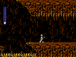
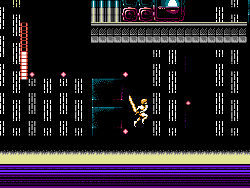
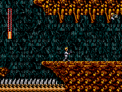
NES - The detail level here is fairly mixed all in all, but its respectable. Most of the early part of the game takes place in a selection of caves, the texturing here is all quite good but all the caves generally re-use the same artwork, just changing the colour palette around from one cave to the next. The game has an overworld, again with pretty good texturing, and a lot of the levels have some nice elements taken from the films, but some stages can be a little empty (see screenshot 2).
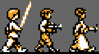
The sprites here look fairly low on detail, being a bit faceless, but are kind of recognisable to the films.
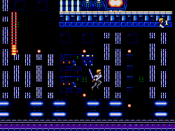
Master System - This is a port of the NES game but the developers of this version have actually done a very good job of improving the graphics in the transition, and most levels show a very definite improvement. Improvements range from fairly minor, though welcome additions such as vents, extra lights and control panels (see screenshot 2), to the complete replacement of some textures for certain backgrounds (archways in Mos Eisley) and objects (the millennium Falcon itself has gone through a huge improvement here, looking much closer to the movie source material). |
| |
| |
Winner Is: Master System |
| |
-------------------------------------------------------------------------------------------------------------- |
| |
Colour |
| |
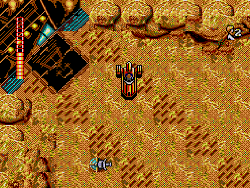
NES - The overall colour here is just about passable. The game's backgrounds look very low colour throughout, often being only a few shades of one colour, and a lot of elements tend to use odd, ill-fitting colours (see the pale yellow, and purple of the deathstar in screenshot 2, and the ground in the overworld in screenshot 3).
The player sprites here also look very, very low colour, they're not realistically coloured at all, and the three characters are based on the same ill-fitting white/yellow/black combination of colours.
Master System - Just like we had with the detail section, this version's colour has been overhauled. The overworld, and deathstar interiors use much better-fitting colours here (see screenshots 2 and 3), and all of the low colour cave areas are a little more fleshed out in their colour counts (see screenshot 1), creating much richer texturing.
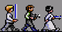
The player sprites here have also gone through a huge improvement, and are now coloured more realistically. Trousers, shirts, skin, and hair are all coloured independently here, and there's some extra shading too. |
| |
| |
Winner Is: Master System |
| |
-------------------------------------------------------------------------------------------------------------- |
| |
Animation |
| |
NES - The animation is pretty good overall, the sprites are well animated, and the backgrounds have little effects going on, such as turning cogs, and flashing lights.
Master System - The characters are pretty well animated, but the background animations mentioned earlier have been slightly downgraded, the cogs for instance have a cruder colour-cycling style animation to them. |
| |
| |
Winner Is: NES |
| |
-------------------------------------------------------------------------------------------------------------- |
| |
Scrolling |
| |
NES - Very good scrolling.
Master System - The scrolling here doesn't feel quite as smooth as it did in the NES version, but its respectable. |
| |
| |
Winner Is: NES |
| |
|
| |
Sound |
| |
|
| |
Music |
| |
NES - The music here is quite catchy, and over the top, it really doesn't let up for a second and does a pretty good job of keeping the blood pumping whilst you're playing through the game. Unfortunately during some stages the music does actually noticeably cut out when the sound effects are being played though (especially at the space port on Mos Eisley)
Master System - The music here sounds pretty good, but doesn't have the same level as energy as the NES version did, it sounds a little sparser. Even so this still has its merits, and the more laid back music also suits the game quite well.
The sound effects here don't interfere with the music as noticeably as they did in the NES game (the lightsaber tends to drown out the music more than cut elements of it out), and there seems to be an extra tune added to the sandwalker stage.
All in all its quite a hard decision, but I'm going to give this round to the NES version. |
| |
| |
Winner Is: NES |
| |
-------------------------------------------------------------------------------------------------------------- |
| |
Sound FX |
| |
NES - The sound effects are respectable, and do their jobs for the most part. The blaster, and lightsaber sound decent, and most of the major elements have sound effects with only the occasional omission.
Master System - This version has more sound effects than the NES version did (you can hear dripping sounds, and more defined impact sounds for the blaster for instance), and some of the other sound effects seem more fitting (to my ear the lightsaber sounds closer to the original movies here than it did in the NES game). |
| |
| |
Winner Is: Master System |
| |
|
| |
Gameplay |
| |
NES - Essentially Star Wars plays like Mega Man with adventuring aspects. Like in Mega Man the game mainly has you shooting at enemies and navigating difficult platforming jumps, but here you start of in a non-linear overworld connected to different stages, some of which need to be completed to progress the story, and others which need to be done to attain important items (such as the lightsaber, and shields for the Millennium Falcon which are helpful later on).
The game has a lot of variety, with a handful of stages putting you into space battles and a final level which is set out like a vertical shoot-em-up, and there are some memorable gameplay mechanics, such as lifts with throw you up into the air, and travelators which allow you to get a run up to do a extra high jump.
Now, onto the bad. This game is quite simply too hard, its full to the brim with frustrating sections and unfair design choices, from the short down-time invincibility after being hit (causing you to often bounce back and forth taking damage until you die), to the general speed at which your energy depletes (often you'll go from full health to death before you realise what's happened), to the lifts which exit directly in front of gun emplacements, to the lack of respawn points, etc, it all feels really quite cheap, and brutal. On top of those you also take damage if you fall too far, and in a game where you're constantly navigating small platforms this is a real annoyance, and really eats away at your health over time.
Master System - Firstly, its important to mention that the control in this version feels a little bit loose in comparison to the NES original, it doesn't quite feel as precise and smooth as the NES game, and it also slows down a little more.
Onto the good points. Thankfully the developers here have actually put nearly the same amount of work into improving the gameplay here as they did the graphics, the whole game seems to have been gone over in an attempt to iron out all of the wrinkles. SMS Star Wars now has two separate difficulty settings, on default you no longer take any damage from falling, and your invincibility time after hits is much, much longer (at least twice the time). The aforementioned two elements alone make an absolutely huge difference to the game, but they're far from all that's been done, health power-ups have been moved, some of the particularly nasty enemies (such as the ones set-up next to lift exits and insects which were placed to hit you mid jump, knocking you onto spikes) have been removed entirely, and the damage allocation is different too (Stormtroopers here do 4 damage when they shoot you, and 1 damage when they make physical contact, in the NES game they did a whopping 12 damage when making contact, nearly killing you outright from full health!).
If this was all the Master System version did then I would be wary of fully recommending it, as whilst hating the fact that you take damage from falling too far, I can see that the removal of this element affects the level design (some stages can now be cut down heavily simply by dropping from gaps in the floor, as you don't have to worry about being hurt from falling too far anymore), however this version actually includes a difficult mode which re-instates all of the enemies, and the fall damage (it actually keeps the longer invincibility time though, so its still fairer than the NES version).
All in all the changes have a very, very positive effect on the gameplay, the frustration factor of the original game is almost entirely gone, and it all feels like a much more fun, and enjoyable experience. |
| |
Winner Is: Master System |
| |
|
| |
Presentation |
| |
NES - The game actually has quite a lot of nice presentation in it, with a good intro, and between level scenes explaining the plot developments as they happen.
Master System - All the presentation seems to still be there, with graphical improvements to all of the portraits. |
| |
Winner Is: Master System |
| |
|
| |
Conclusion |
| |
Overall this is a very easy win for the Master System, to be honest the more time I spent playing the games for this comparison, the more I wondered if I could even class the NES version as even being a decent game, its a frustrating, flawed, and ugly experience, thankfully the SMS version fixes most (if not all) of its major issues. |
| |
Overall Winner Is: Master System |
| |
-------------------------------------------------------------------------------------------------------------- |
| |
|
| |
|
|
|
|
|